Graphic design / Linkedin posts / Advertising

GRAPHIC DESIGN
A complete rebranding for QuickExchange: new visual identity, graphic system and communication materials, just more modern.
QuickExchange was already a well-established name in currency exchange in Ticino when they entrusted us with a full renewal of their visual identity.
The brief was clear: modernise the brand without betraying the trust built over the years, striking the right balance between the solidity of a long-standing operator and a forward-looking positioning in the world of Bitcoin, gold and cryptocurrencies.
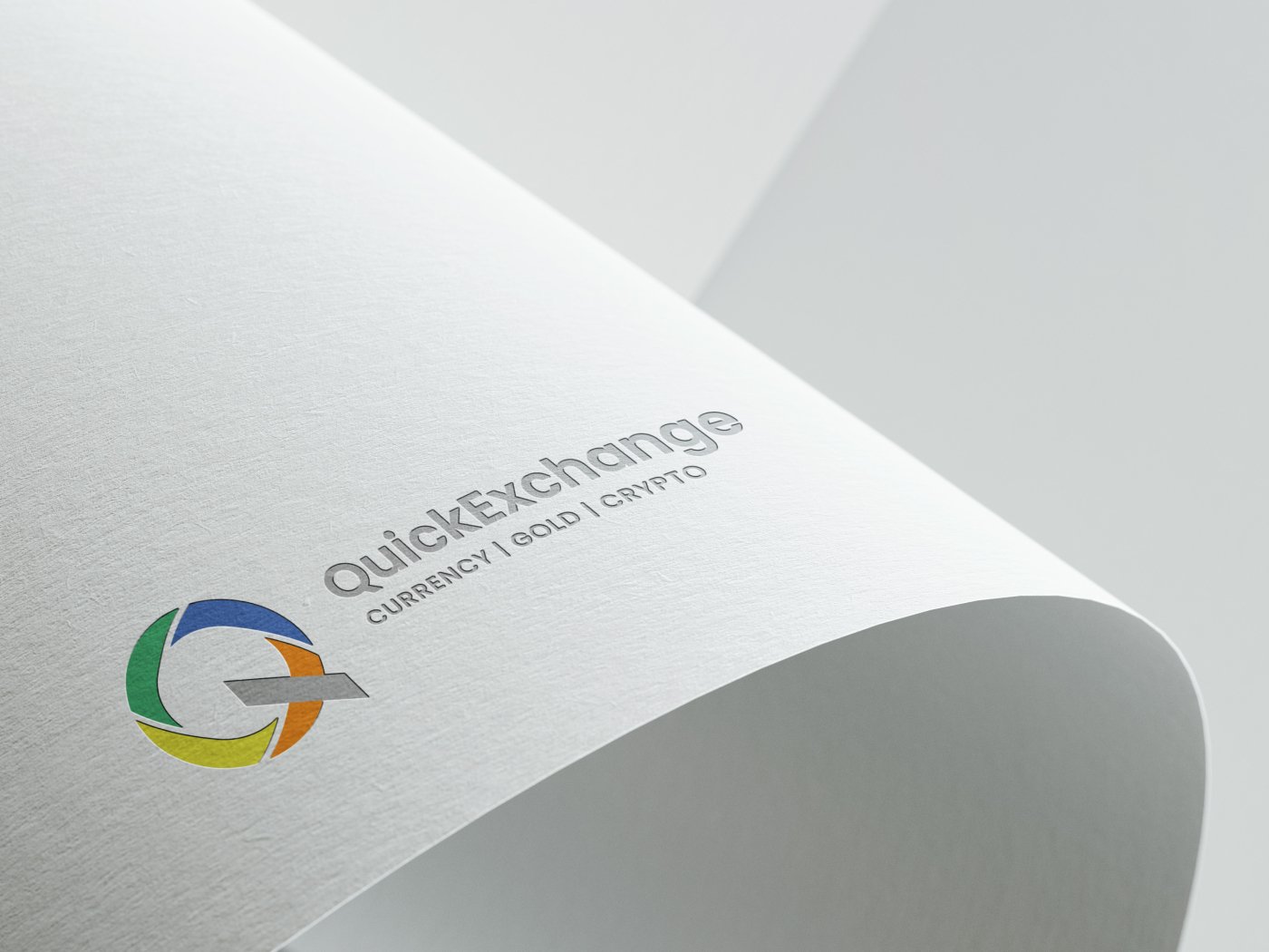
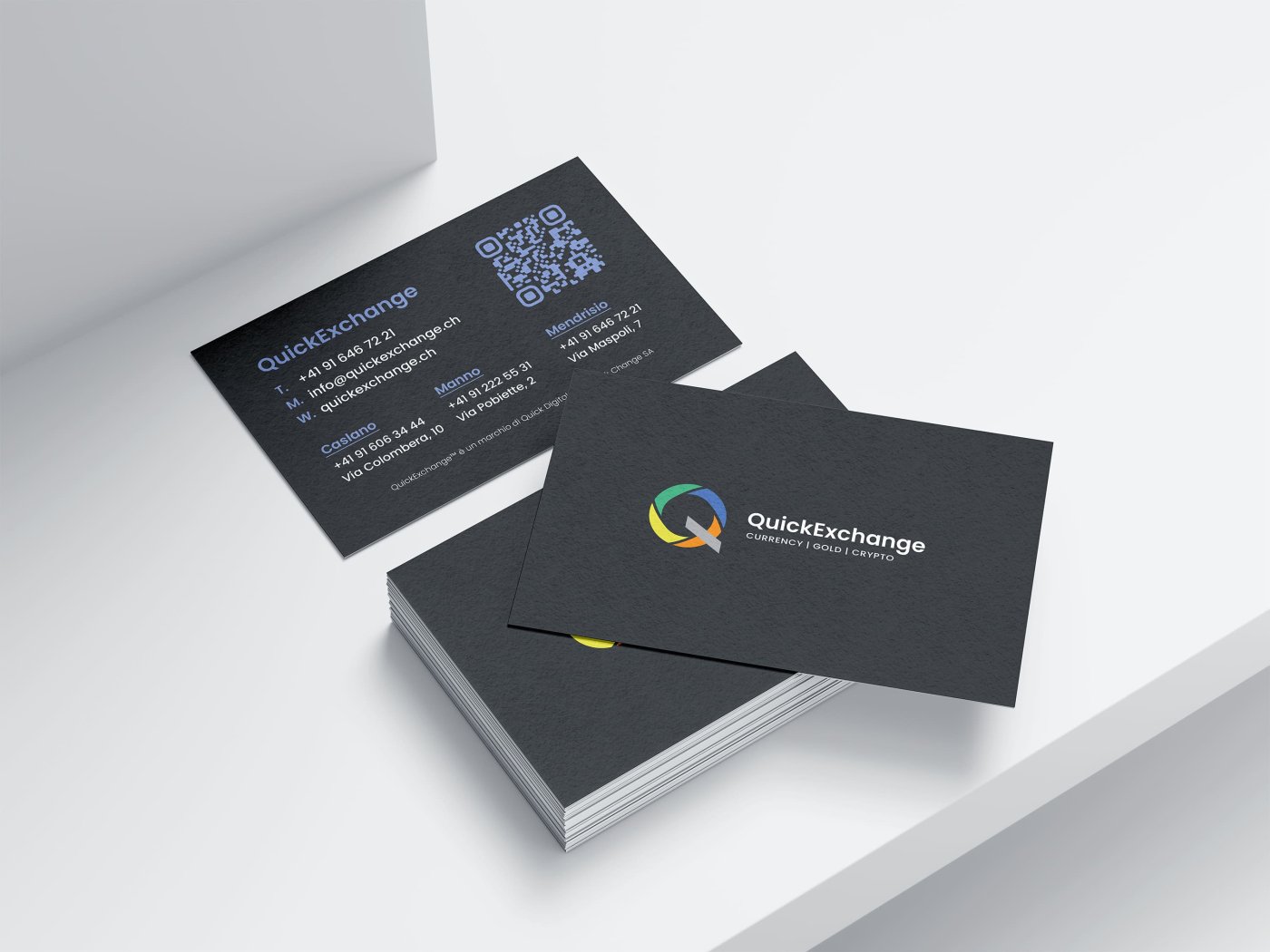
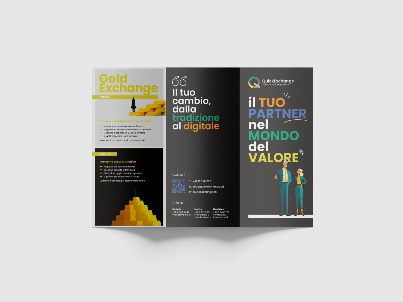
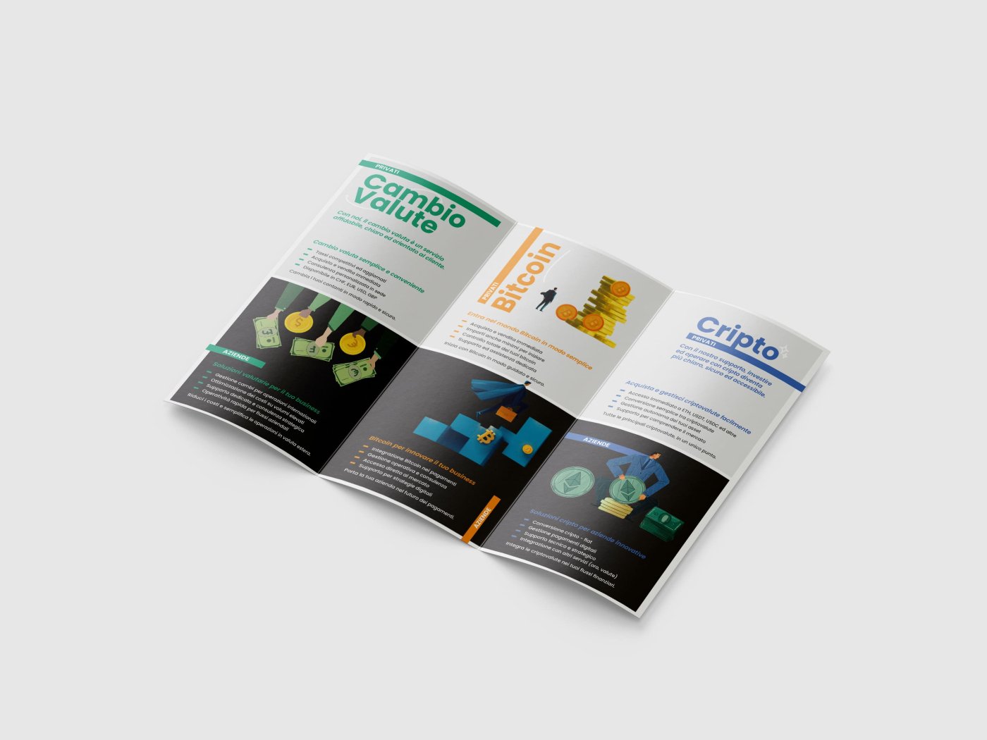
We redesigned the logo, redefined the colour palette, typography and overall graphic system, consolidating everything into a brand manual. From the new identity, we then developed the entire printed materials system: business cards, brochure and trifold distributed across the three physical locations, consistent, professional and instantly recognisable.
WEB DESIGN
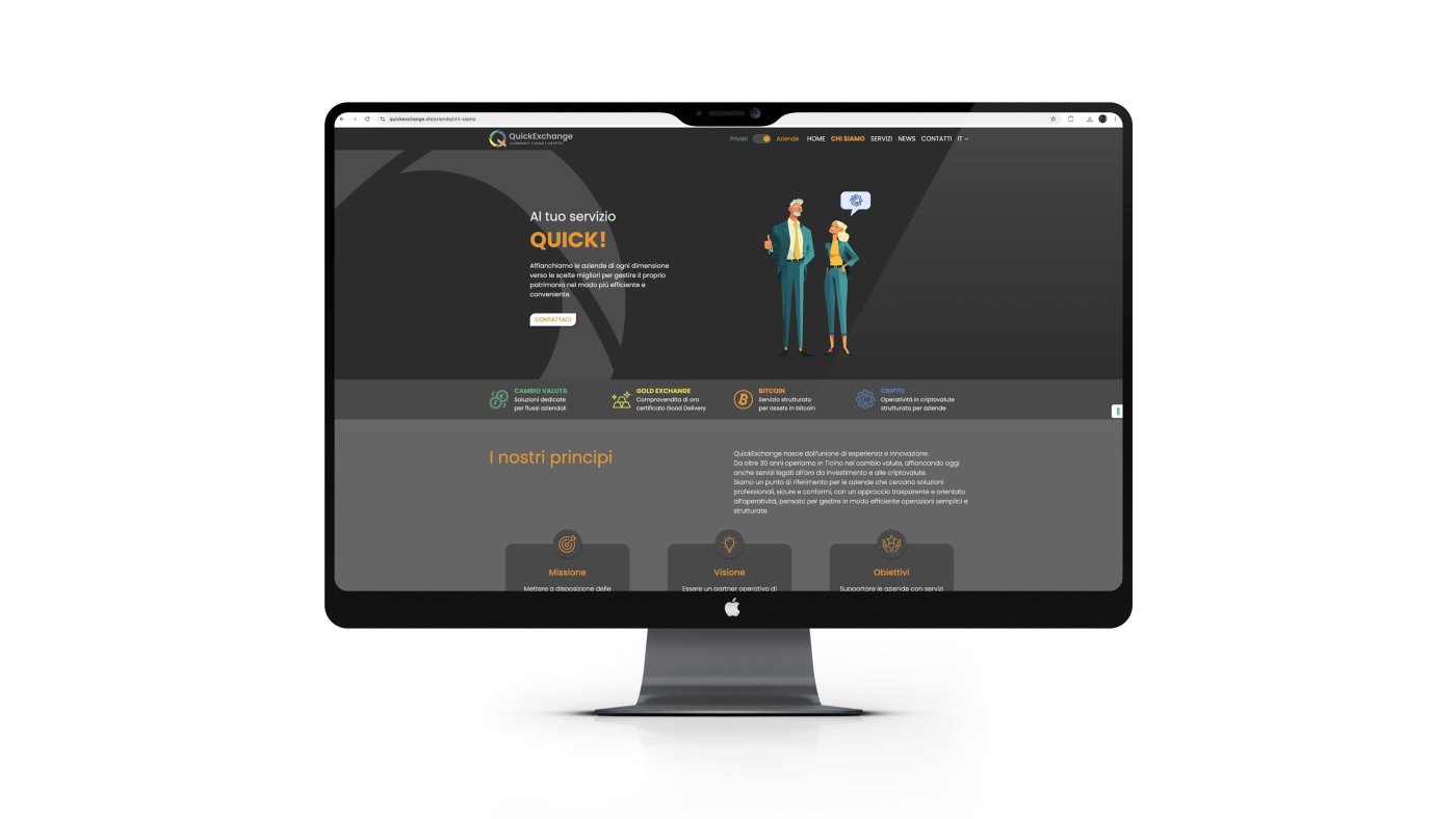
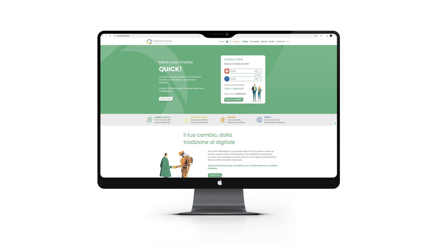
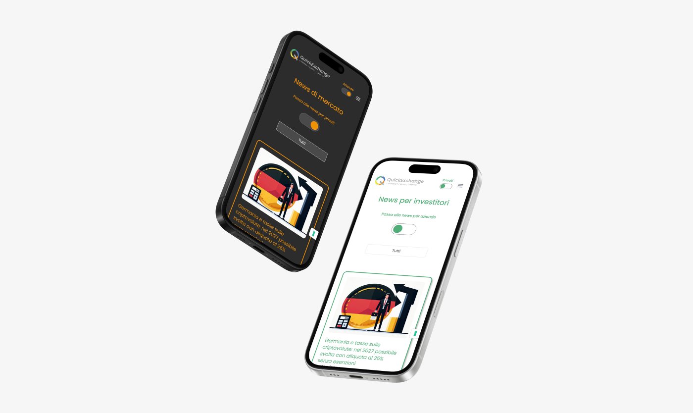
A website that combines simplicity and power, with real-time online exchange rates and navigation designed for both private clients and businesses.
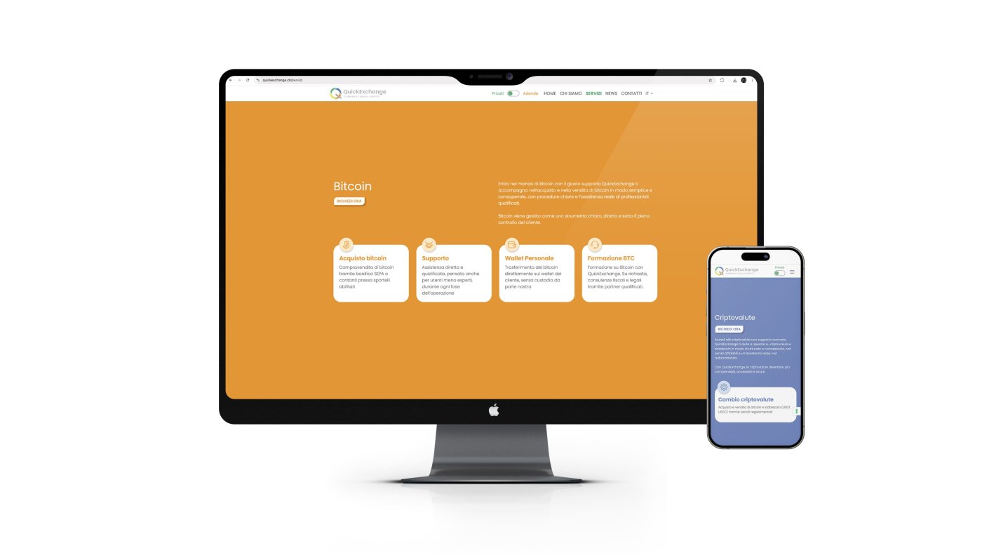
We built a website for QuickExchange that reflects the company's dual nature: the solidity of an established currency exchange operator and the ability to offer innovative financial services.
The site features a real-time online exchange system, separate navigation for private clients and businesses, and dedicated sections for each service: Currencies, Gold Exchange, Bitcoin and Cryptocurrencies.
The result is a clear, fast platform fully aligned with the brand identity.
OFFICE DECORATION
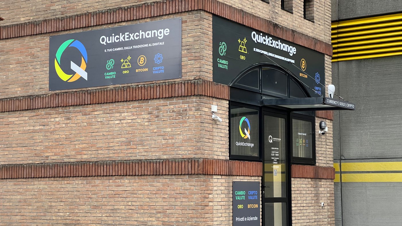
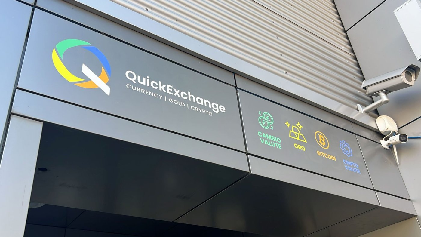
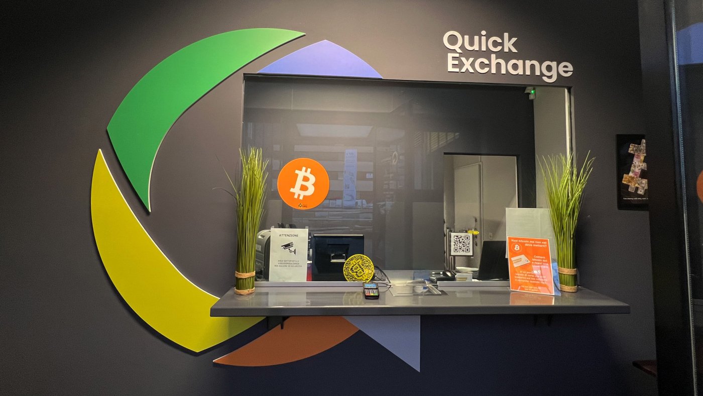
From digital to physical: the window graphics of all three QuickExchange locations bring the brand identity directly to the street.
The window signage system applied to the Caslano, Manno and Mendrisio locations brings QuickExchange's visual identity directly into the physical space.
Each location was treated with graphic solutions consistent with the brand yet adapted to the architectural specifics of each premises, ensuring visibility, aesthetic impact and immediate recognition from passers-by.
The result is a physical presence that speaks the same language as the website, printed materials and digital channels.

-
Rebranding / Linkedin posts / Web Design
-
Graphic Design / Advertising
-
Graphic design / Logo design / Advertising / Video
-
Graphic design / Web design / Social media management