Graphic design / Linkedin posts / Advertising

REBRANDING
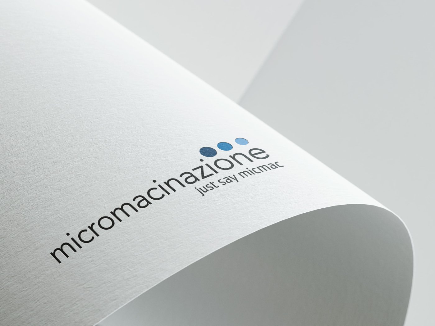
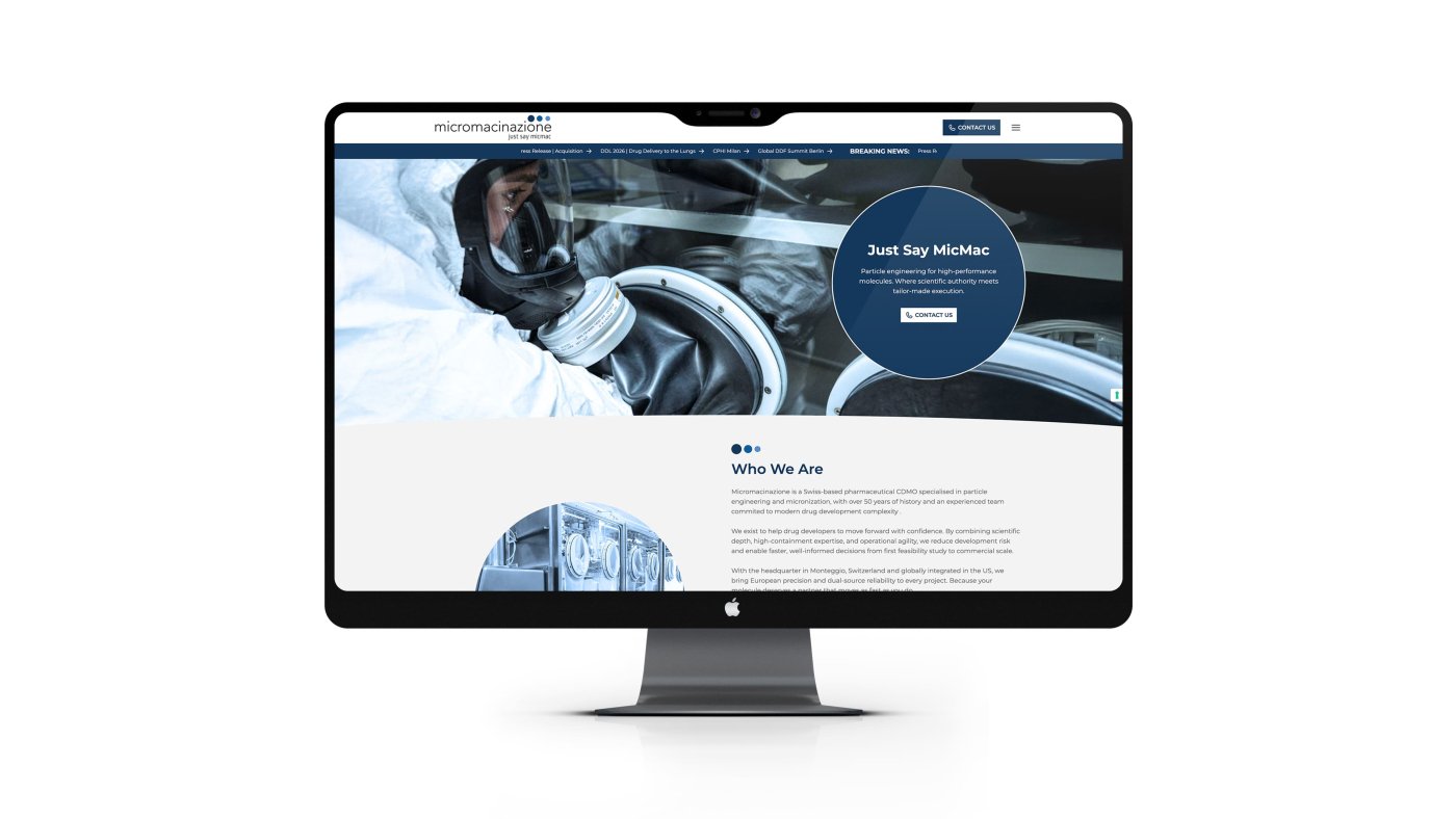
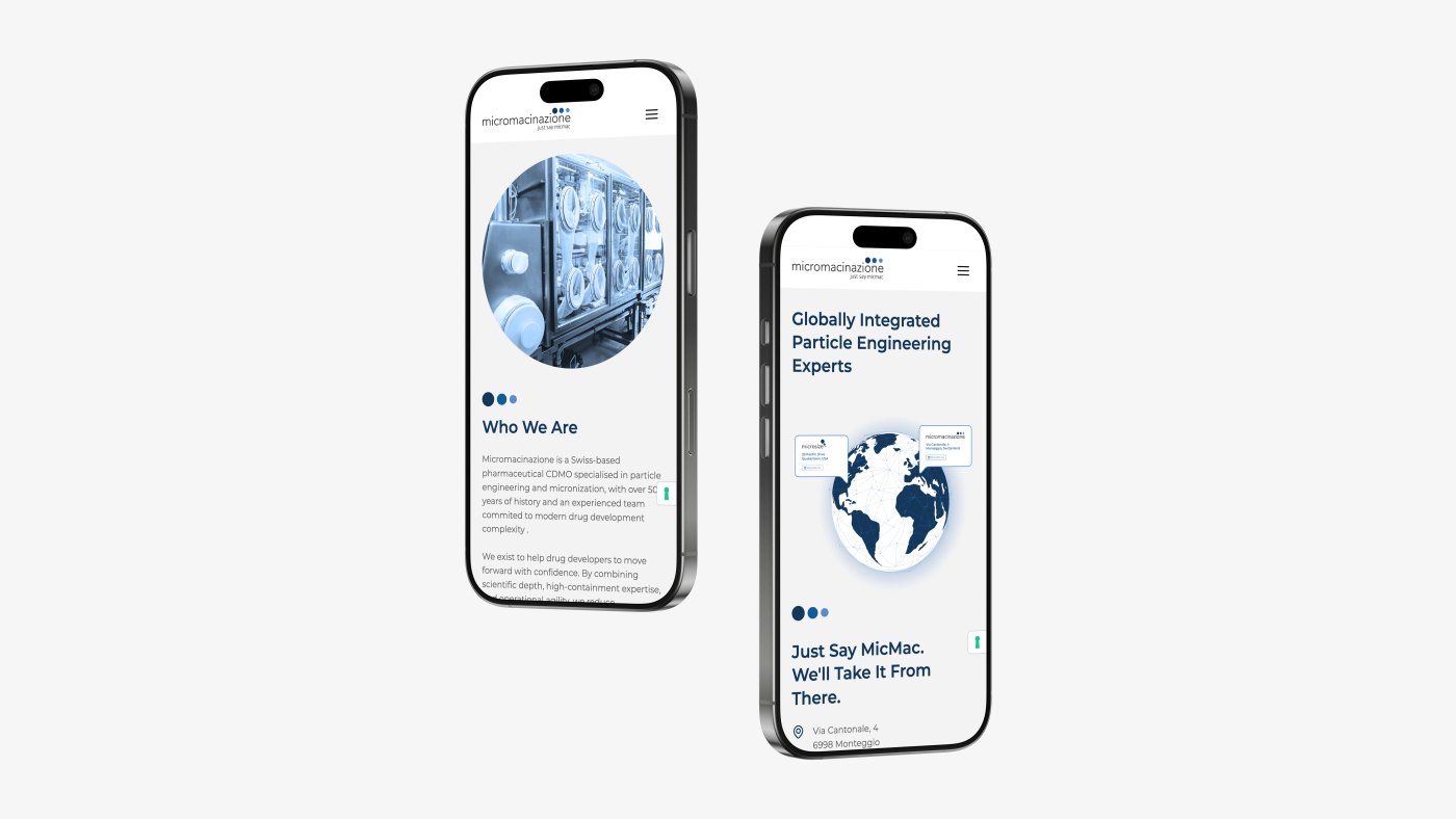
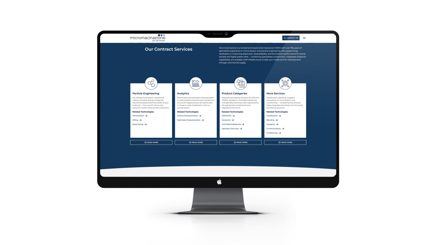
We redesigned Micromacinazione's visual identity, giving the brand a language that speaks to an international market.
The new logo preserves the rigour of a company with over 50 years of history in the pharmaceutical sector, reinterpreting it with a modern and recognisable aesthetic. The graphic mark, three circles in gradient, distils the scientific precision and technological progression that define MicMac's approach. The claim "just say micmac" completes the identity with simplicity and authority.
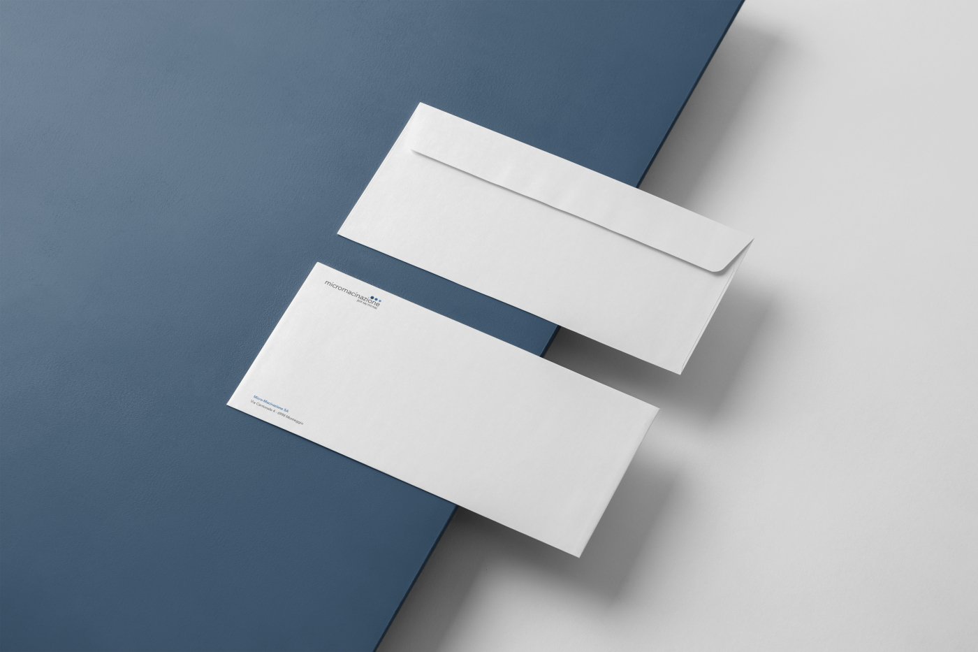
The brand identity system was extended to business cards and headed envelopes, ensuring consistency and professionalism at every client touchpoint.
LINKEDIN POSTS
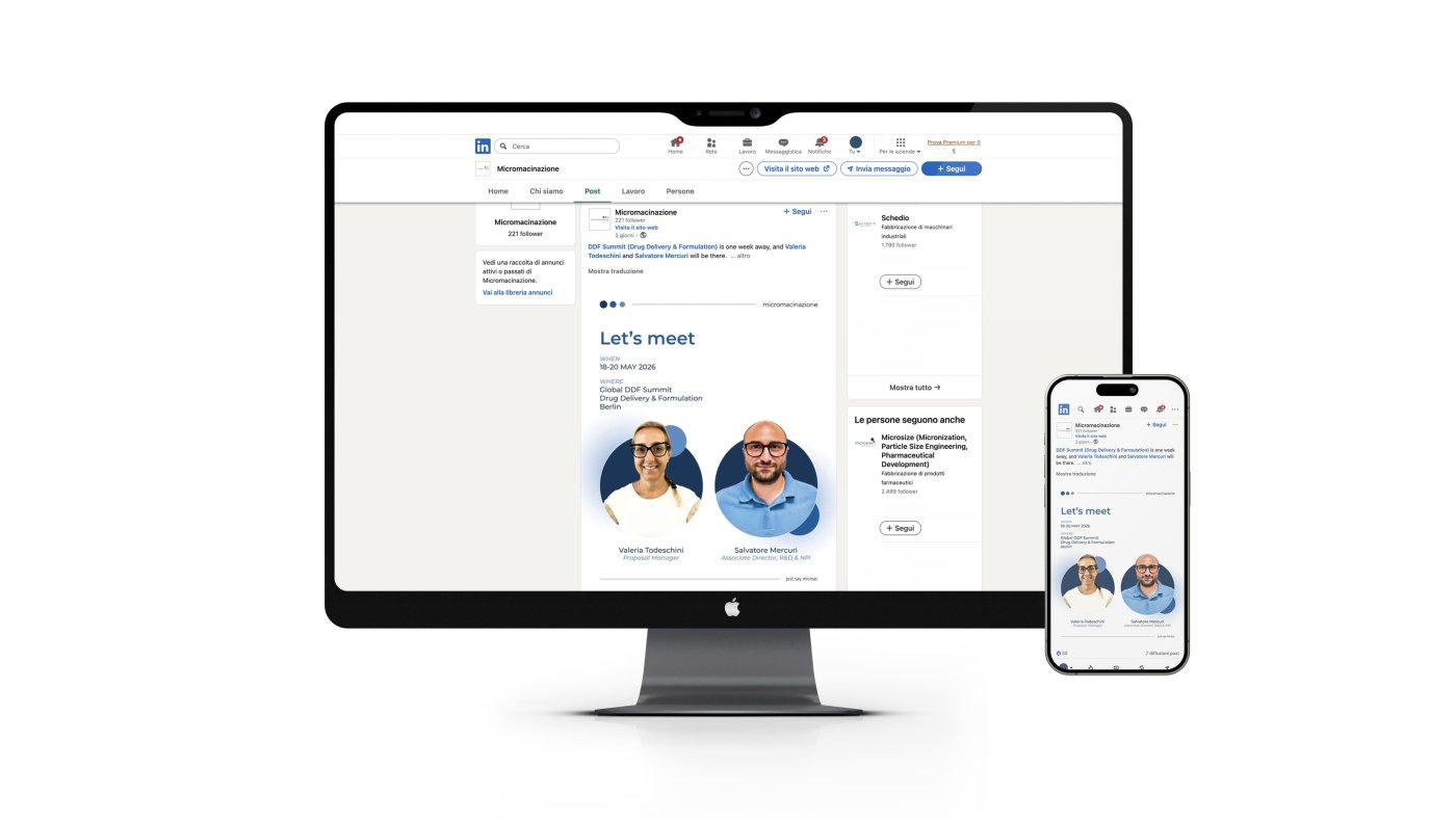
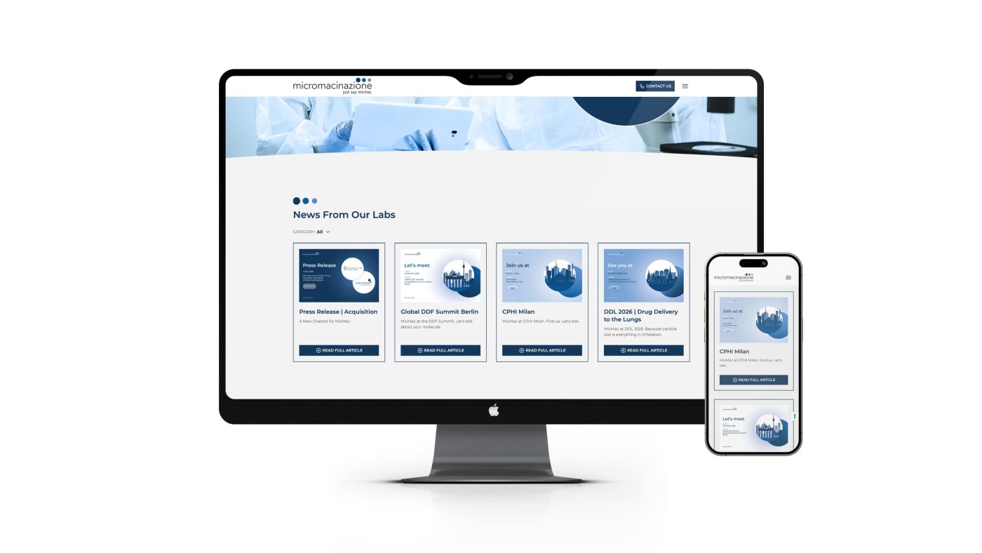
We create visual content for LinkedIn and for the website’s News section, building a coherent and recognizable digital presence.
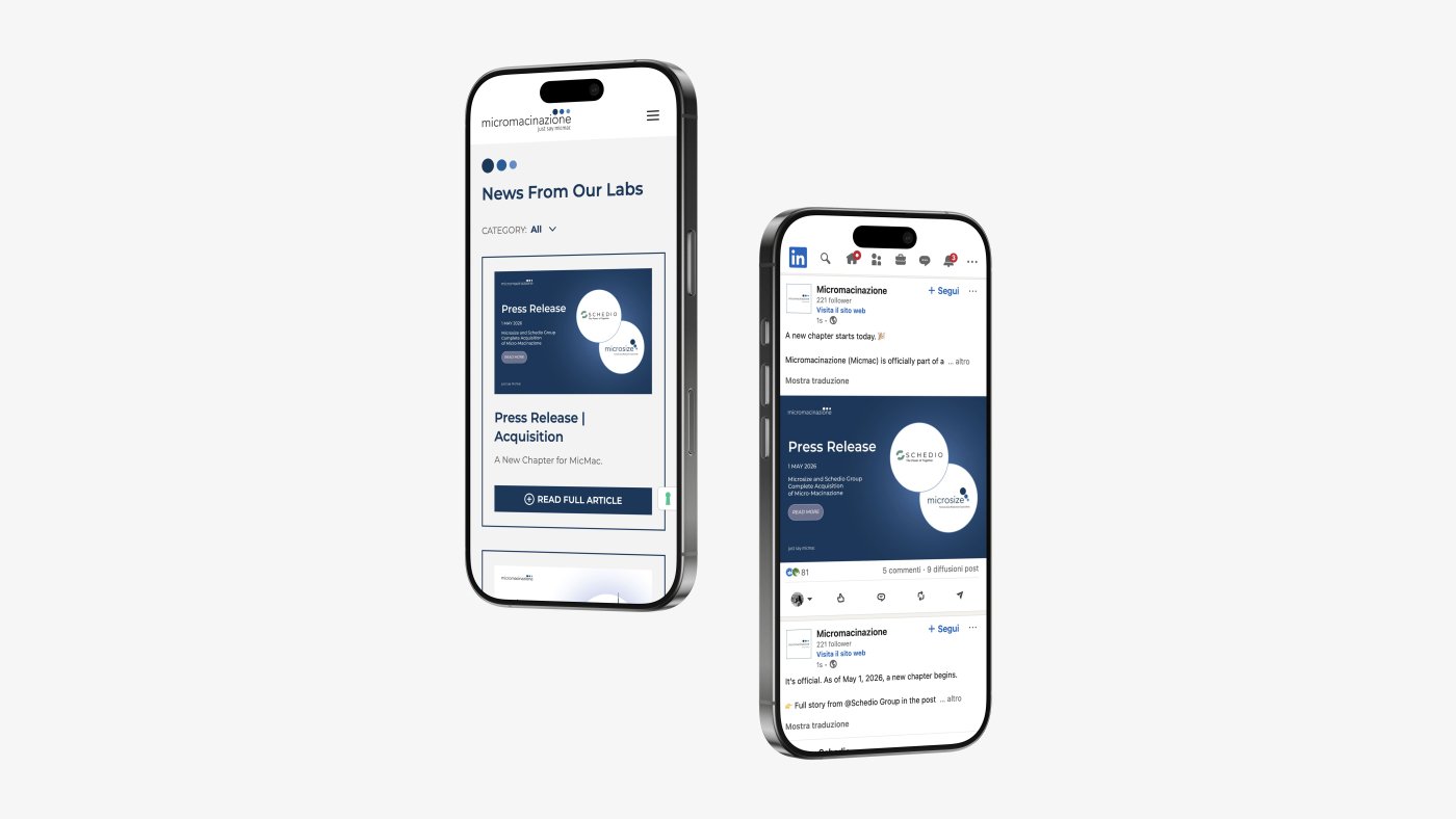
LinkedIn posts follow a structured and professional format, built around the brand palette, with a clear typographic hierarchy that remains highly readable on mobile devices. Content ranges from announcements of participation in international trade fairs and events, to strategic communications such as acquisitions and partnerships, as well as updates on particle engineering services.
Visuals for the website’s News section maintain the same graphic system used for social posts, creating continuity across digital channels and strengthening brand recognition at every touchpoint.
-
Rebranding / Graphic Design / Web Design / Office Decoration
-
Graphic Design / Advertising
-
Graphic design / Logo design / Advertising / Video
-
Graphic design / Web design / Social media management